About MAANCY
MAANCY creates high-quality modern jewelry and objects for everyday use. Each piece blends minimalism and surrealism with careful design, making them timeless and versatile. Many items can be worn in different ways, adding to their appeal.
Cultivated with Care
Maancy wanted a straightforward wordmark, so we got started with typefaces right away. After many reiterations and options, the decision was to have something clean and elegant so that her jewelry can shine. This was my first time working with a minimalist brand, which was a challenge for me because I am used to telling clients to tone it down, and in this case, the client was telling me to tone it down!


From Seed to System
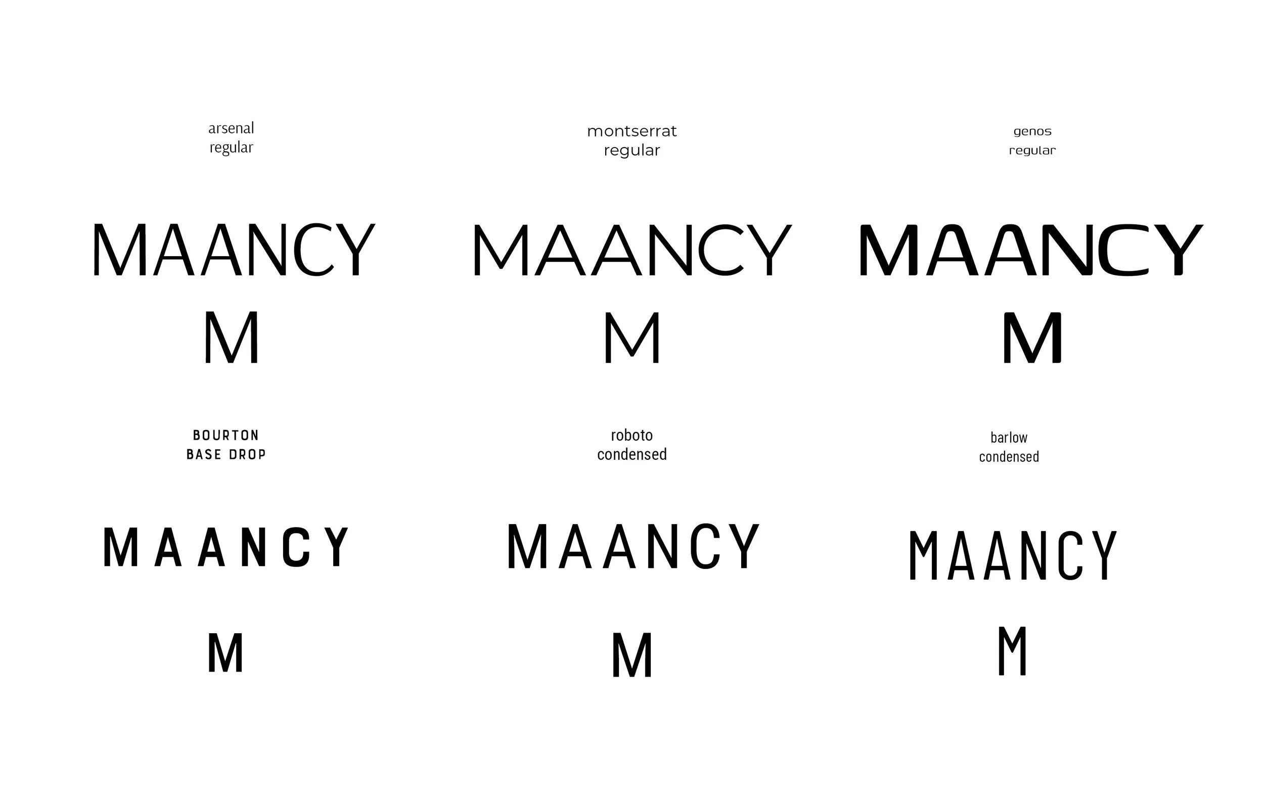
When we started this project, Maancy was sure what type of font she wanted but was curious to see other options in case they sparked her attention.

Refining What’s Growing
The client wanted to see these final fonts side by side with the “M” by itself as she would use it as a secondary logo. Her final choice was Bourton Base Drop.
Strategic Refinement
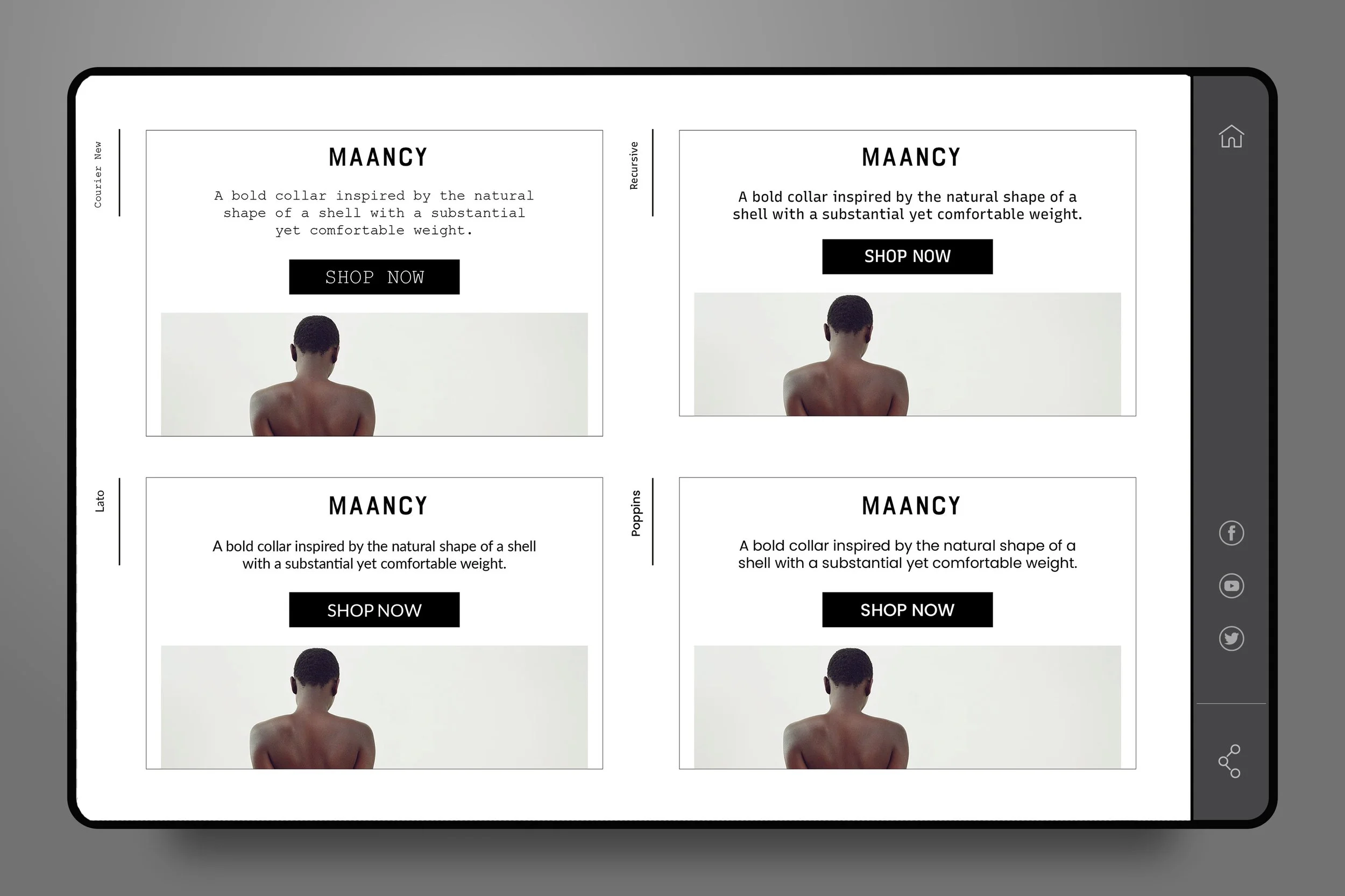
Maancy wanted to see typeface options for Shopify and Omnisend, her email marketing platform. The examples are just mockups, not her actual website or emails.


Design Calibration
The client needed a Pantone color for her marketing materials and for them to be muted. She ended up going with just black and white.
Not Every Seed is Meant for Every Garden
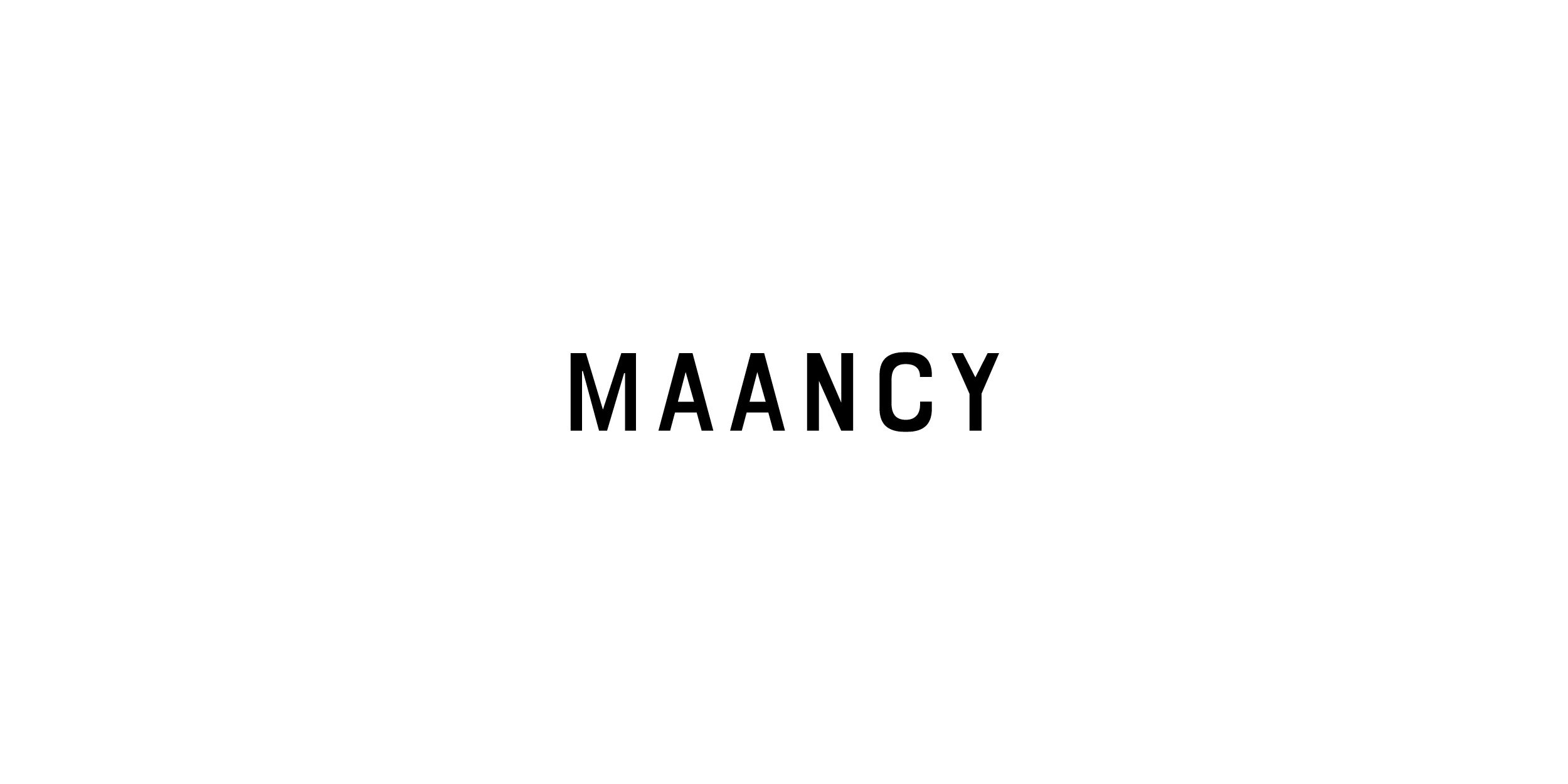
The client found the options creative, but reiterated that she wanted a wordmark with no embellishments.

Let's Work Together!
〰️
Let's Work Together! 〰️
Bring Your Vision to Life
Whether you have a question, an idea, or just want to say hello, feel free to reach out!