About radhouse
radhouse new york is a custom made subscription box. Inside you could find items that the owner Radhika chose herself anywhere from jewelry to clothing.
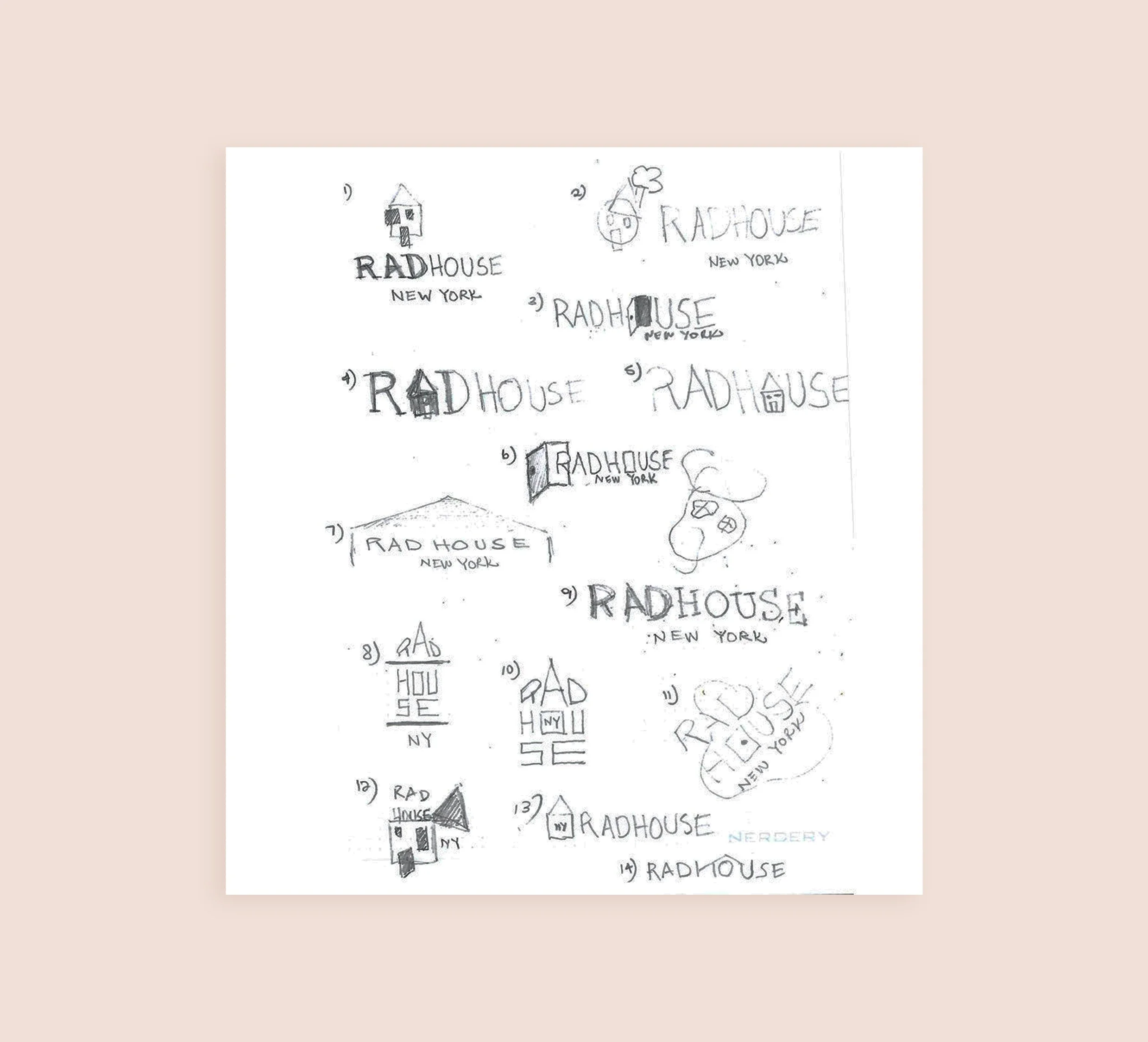
Cultivated with care
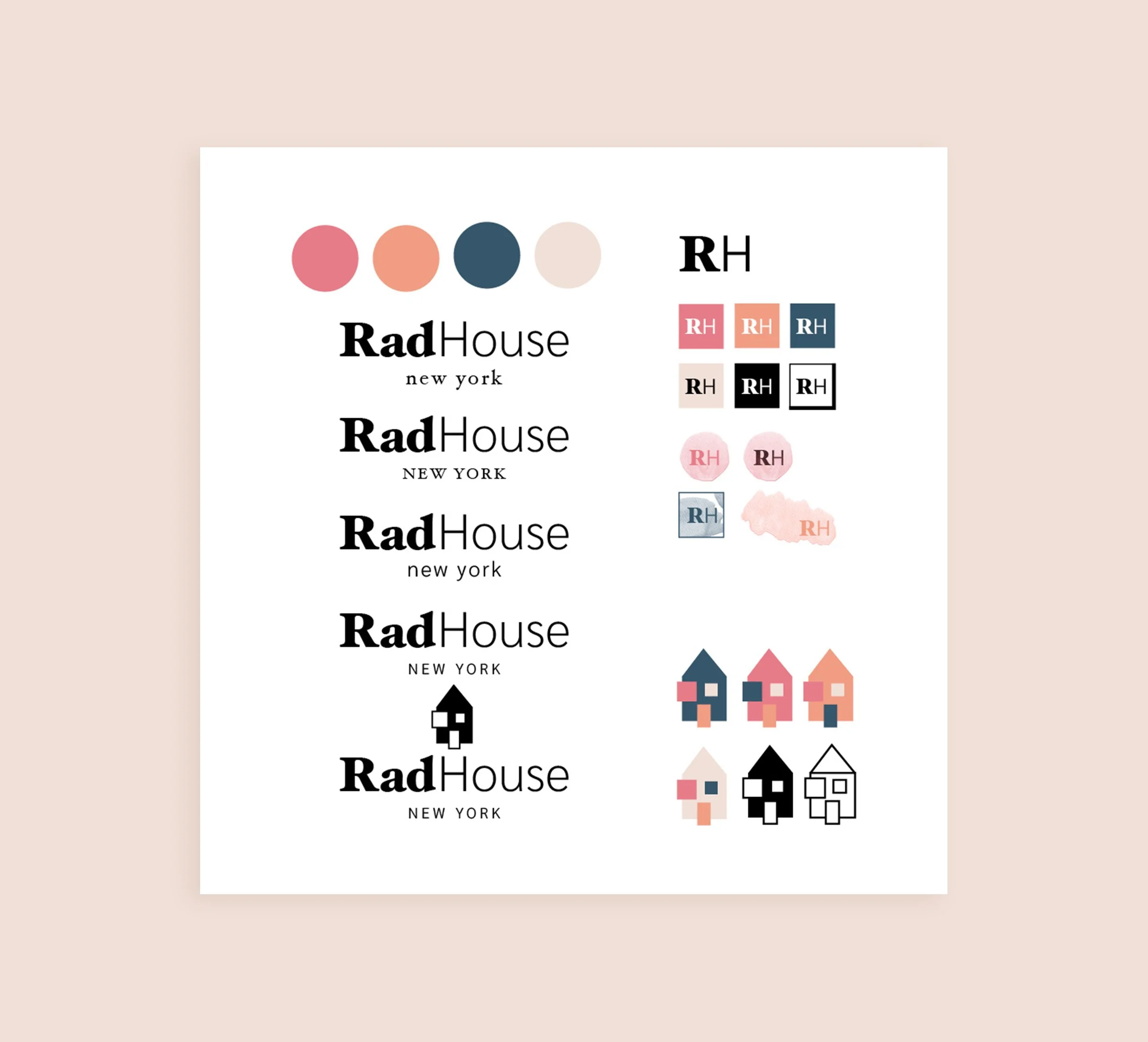
The client was looking for a natural and artistic look focusing on just a wordmark, I wanted to show her different options with an icon. The client chose as a secondary option for her logo. The color palette was created from the clients Pinterest board inspiration. The shapes symbolize a hands-on brand approach, showing dedication in creating each box.


From Seed to System
The client requested a clean typeface that combines Serif and Sans Serif. I experimented with 32 typefaces plus various combinations. This is my favorite part of any project, depending on how the client likes information shared, I could show all typefaces or just 3-5 options.

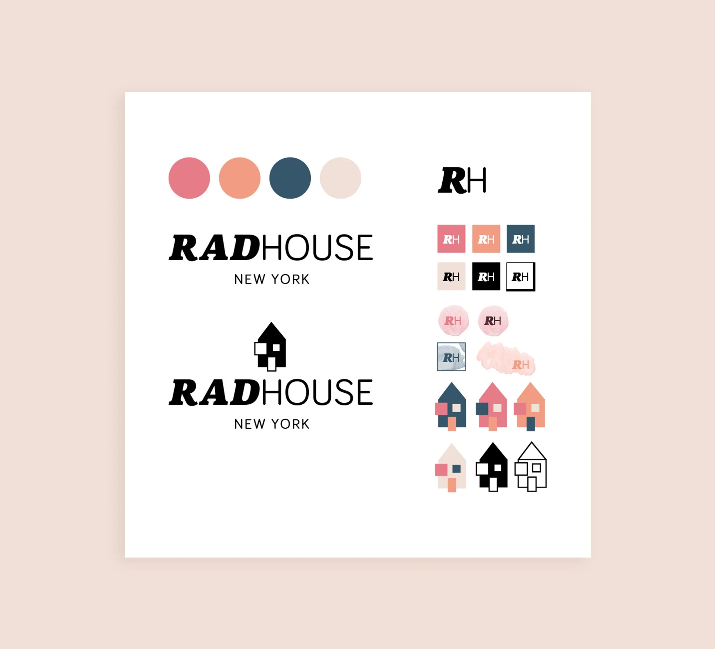
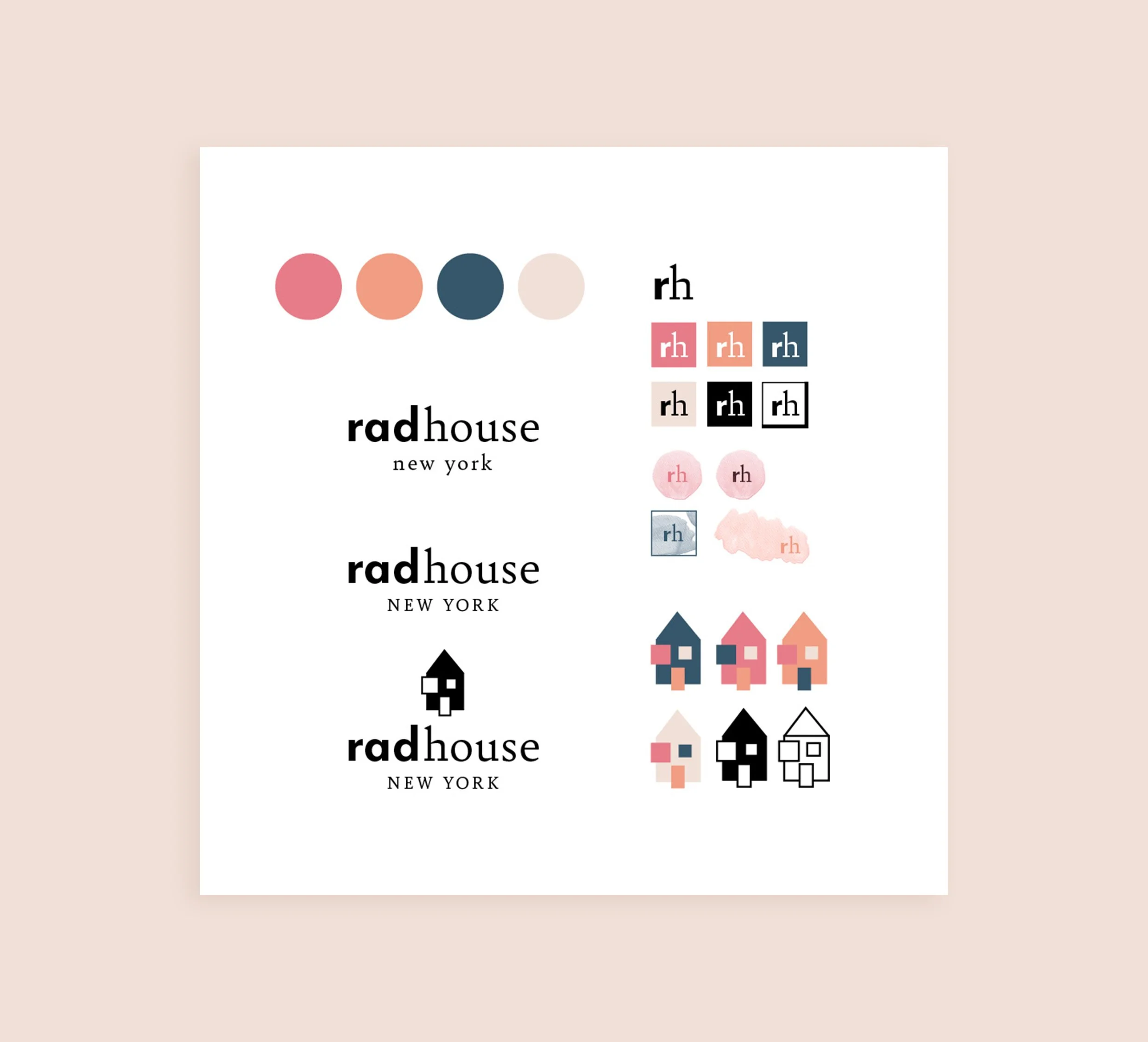
Design Calibration
The client picked 3 different fonts with that I made 3 versions with icons and watercolor shapes.
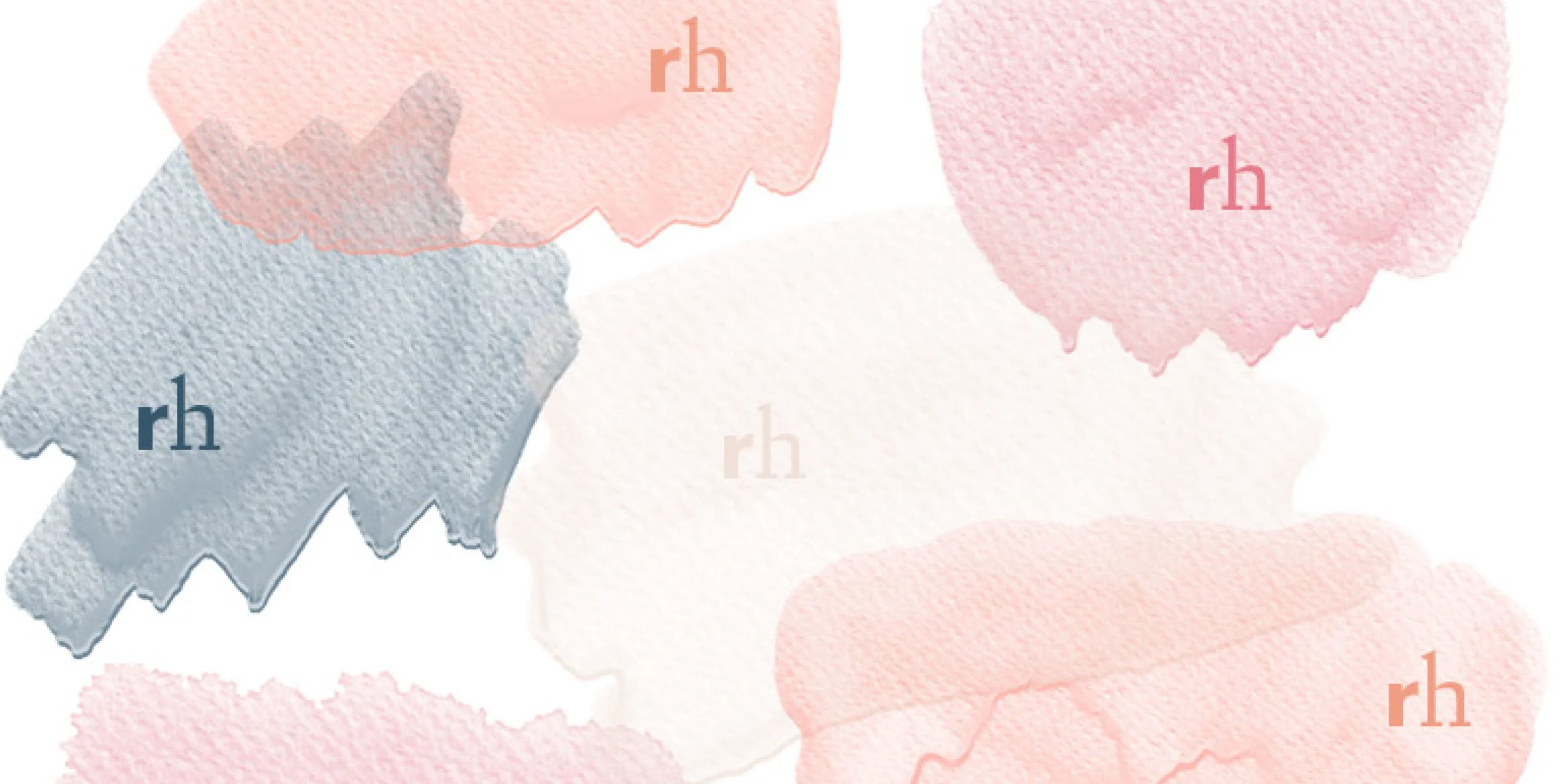
Not Every Seed is Meant for Every Garden
The client wanted watercolor shapes to represent a hand done approach. We added the initials in a variation of the brands colors. This was not a successful option, as it looks messy.

Bring Your Vision to Life
Whether you have a question, an idea, or just want to say hello, feel free to reach out!